6-4 Visualizations#
plotly express
Programming Challenge
Plotly Express#
Plotly Express is a high-level interface for creating beautiful and meaningful visualizations. Plotly Express is easy to use and allows you to create a wide variety of visualizations with just a few lines of code.
https://plotly.com/python/plotly-express/
Difference between seaborn and plotly express:
Unlike seaborn, plotly express does not aggregate data. It is up to you to aggregate the data before passing it to plotly express.
Plotly express is built on top of plotly.js, a JavaScript library for creating interactive visualizations. This means that plotly express visualizations are interactive by default.
Plotly express can draw maps, too.
1# Here's the seaborn code from 6-1
2import seaborn as sns
3pengo = sns.load_dataset("penguins")
4pengo['count'] = 1
5
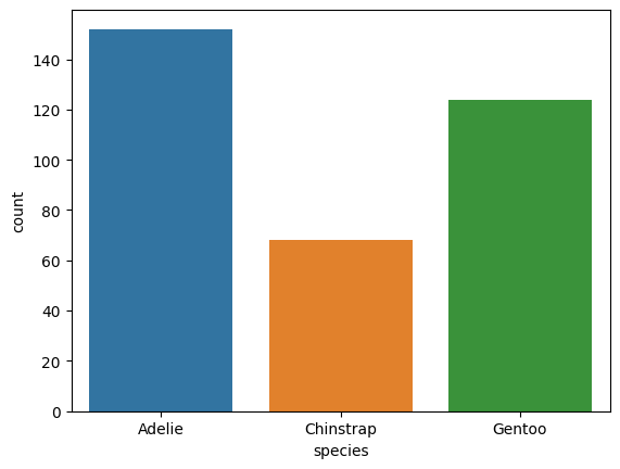
6sns.barplot(data=pengo, x="species", y="count", hue="species", estimator="sum")
<Axes: xlabel='species', ylabel='count'>
1# here's the plotly express equivalent
2import plotly.express as px
3fig = px.bar(pengo, x="species", y="count", color="species", barmode="group")
4fig
Notice the difference#
You can hover, zoom and take a screenshot of the plotly express visualizations.
barmode=groupis used to group the bars in a bar chart. so when you hover over the bars, you can see the values of each bar.
Plotly Express In Streamlit#
use
st.plotly_chart()to display plotly express visualizations in streamlit.pass in the figure as the first argument to
st.plotly_chart(fig).
6-4-st-plotly-express.py
import streamlit as st
import plotly.express as px
import pandas as pd
import seaborn as sns
pengo = sns.load_dataset("penguins")
pengo['count'] = 1

st.title('Plotly Express Example')
fig = px.bar(pengo, x="species", y="count", color="species", barmode="group")
st.plotly_chart(fig) # this displays the plotly express visualization in streamlit
Summarizing Data for Plotly Express#
Depending on your data, you may need to summarize it prior to plotting it with plotly express. For example, if you have a dataset with multiple rows for each observation, you may need to aggregate the data before passing it to plotly express.
this can be accomplished with a df.groupby() or pd.pivot_table()
6-4-st-plotly-express-summary.py
Lots of examples#
The rest is up to your! Some examples to follow
Here: https://plotly.com/python/plotly-express/
1import seaborn as sns
2tips = sns.load_dataset("tips")
3
4# text_auto=True shows the count of observations in each bin
5fig = px.density_heatmap(tips, x="total_bill", y="tip", text_auto=True)
6fig.show()
 1import pandas as pd
 2import random
 3stlucia_df = pd.read_csv("https://raw.githubusercontent.com/mafudge/datasets/refs/heads/master/st-lucia/parishes.csv")
 4stlucia_df['Amount'] = stlucia_df.apply(lambda row: random.randint(50,500), axis=1)
 5
 6# Saint Lucia Parishes - Scatter
 7fig = px.scatter_mapbox(stlucia_df,  lat="Lat", lon="Lng", zoom=10, color = 'Parish', hover_name = 'Parish', size = 'Amount',  mapbox_style="open-street-map")
 8fig.show()
 9
10# Saint Lucia Parishes - Density
11fig = px.density_mapbox(stlucia_df, lat='Lat', lon='Lng', z='Amount', radius=10, center=dict(lat=13.9, lon=-60.97), zoom=10, mapbox_style="open-street-map")
12fig.show()