6-1: Visualizations#
Streamlit and seaborn
histplot, lmplot, boxplot, violinplot
Datasets we will use#
“tips” One waiter collected 244 data points about his tipping customers. https://rdrr.io/cran/reshape2/man/tips.html
Fast Food Nutrition https://www.kaggle.com/datasets/joebeachcapital/fast-food
1import pandas as pd
2import seaborn as sns
3import matplotlib.pyplot as plt
4tips = sns.load_dataset('tips')
5nut = pd.read_csv("./data/fast_food_nutrition_cleaned.csv")
Histograms#
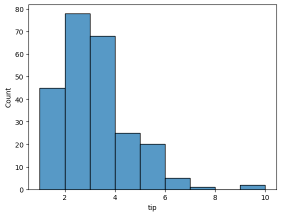
A histogram is a graphical representation of the distribution of numerical data. It is an estimate of the probability distribution of a continuous variable.
To construct a histogram, the first step is to “bin” the range of values—that is, divide the entire range of values into a series of intervals—and then count how many values fall into each interval. The bins are usually specified as consecutive, non-overlapping intervals of a variable. The bins (intervals) must be adjacent, and are often (but not required to be) of equal size.
In seaborn we create a histogram using the histplot function.
The
binsnamed argument specifies the number of bins to use.The
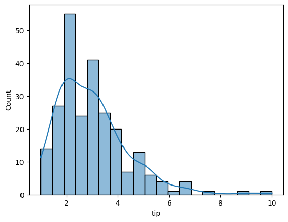
kdenamed argument specifies whether to plot a gaussian kernel density estimate. which is a best-fit line for the data.
1# distribution of tips amount 9 bins
2sns.histplot(data=tips, x='tip', bins=9)
<Axes: xlabel='tip', ylabel='Count'>
1# distribution of tips amount 9 bins
2sns.histplot(data=tips, x='tip', bins=20, kde=True)
<Axes: xlabel='tip', ylabel='Count'>
Challenge 6-2-1#
Create a streamlit with a histogram of the calories column in the fast food dataset.
fast_food_nutrition_cleaned.csv
the input is the number of bins as a slider. between 1 and 100 bins.
What happens to the data shape when you increase the number of bins?
LM Plots#
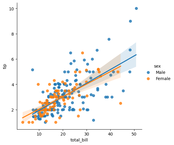
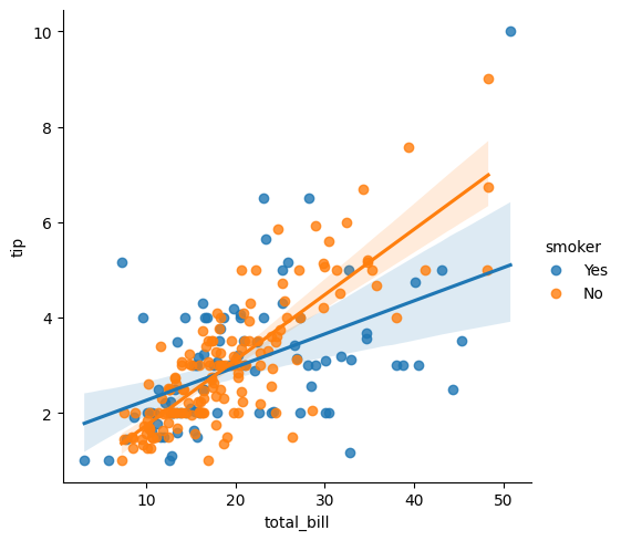
A lmplot is a scatterplot with a linear regression line.
Linear regression is a linear approach to modeling the relationship between a scalar response (or dependent variable) and one or more explanatory variables (or independent variables). The case of one explanatory variable is called simple linear regression; for more than one, the process is called multiple linear regression.
1# let's compare total bill to tip amount, separated by the diner's sex
2sns.lmplot(data=tips, x='total_bill', y='tip', hue='sex')
<seaborn.axisgrid.FacetGrid at 0x270d36c4ef0>
1# let's compare total bill to tip amount, separated by if the diner is a smoker
2sns.lmplot(data=tips, x='total_bill', y='tip', hue='smoker')
<seaborn.axisgrid.FacetGrid at 0x270d3742870>
Challenge 6-2-2#
Create a streamlit with the fast food dataset.
fast_food_nutrition_cleaned.csv
Let’s plot calories vs. sodium broken down by the type fast food restaurant.
Create a streamlit to allow the user to select two restaurants to compare.
Which restaurant is the worst?
Box Plots and Violin Plots#
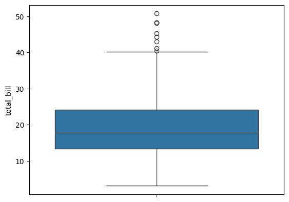
A box plot is a method for graphically depicting groups of numerical data through their quartiles. The box extends from the Q1 to Q3 quartile values of the data, with a line at the median (Q2). The whiskers extend from the edges of the box to show the range of the data.
They extend no more than 1.5 * IQR (Inter-quartile-range) (IQR = Q3 - Q1) from the edges of the box, ending at the farthest data point within that interval.
The line through the box is the median value of the data.
The box represents the interquartile range. Q3 - Q1
The whiskers represent the range of the data, defaults to 1.5 * (Q3 - Q1), a general rule for outliers.
Outliers are plotted as separate points.
Think of a box plot as a must more detailed bar chart, since it tells you much more about the data than just totals.
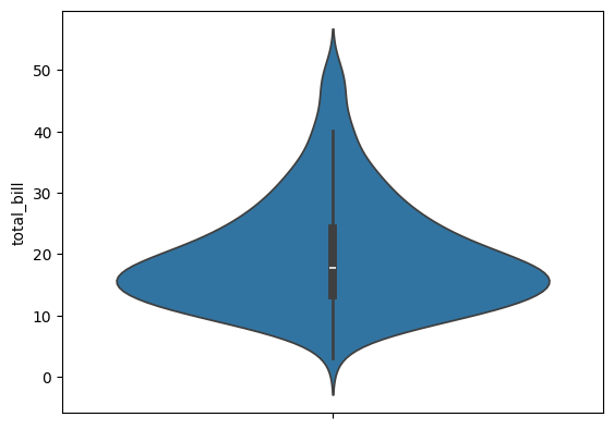
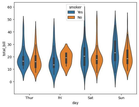
A violin plot is like the combination of a box plot and a histogram. It uses a kernel density estimate to show the probability density of the data at different values.
1# this will help us to see what the box plot and violin plot are showing us
2tips.describe()
| total_bill | tip | size | |
|---|---|---|---|
| count | 244.000000 | 244.000000 | 244.000000 |
| mean | 19.785943 | 2.998279 | 2.569672 |
| std | 8.902412 | 1.383638 | 0.951100 |
| min | 3.070000 | 1.000000 | 1.000000 |
| 25% | 13.347500 | 2.000000 | 2.000000 |
| 50% | 17.795000 | 2.900000 | 2.000000 |
| 75% | 24.127500 | 3.562500 | 3.000000 |
| max | 50.810000 | 10.000000 | 6.000000 |
1# Here's a box plot of total bill by day
2# median = 17.79
3# 25% = 13.3475
4# 75% = 24.1275
5sns.boxplot(data=tips,y='total_bill')
<Axes: ylabel='total_bill'>
1# Here's a box plot of total bill by day
2# median = 17.79
3# 25% = 13.3475
4# 75% = 24.1275
5sns.violinplot(data=tips,y='total_bill')
<Axes: ylabel='total_bill'>
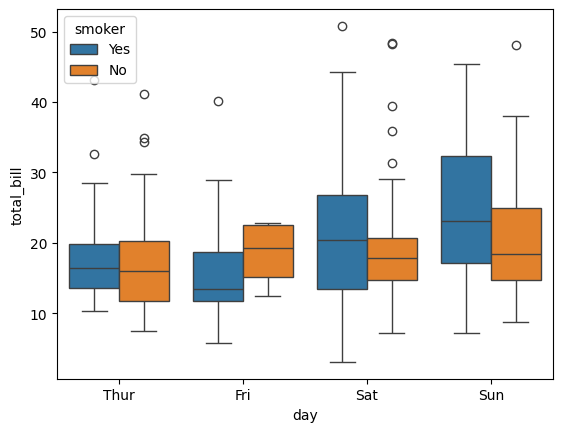
1# Let's boxplot of total bill by day and smoker
2sns.boxplot(data=tips, x='day', y='total_bill', hue="smoker")
<Axes: xlabel='day', ylabel='total_bill'>
1sns.violinplot(data=tips, x='day', y='total_bill', hue="smoker")
<Axes: xlabel='day', ylabel='total_bill'>
Interpreting Box / Violin Plots#
short boxes and whiskers indicate that the data is dense concentrated near the median value.
long whiskers and boxes indicate that the data is spread out.
long whiskers and short boxes indicate that the data is spread out but concentrated near the median value.
short whiskers and long boxes indicate that the data is concentrated but spread out.
Heatmaps#
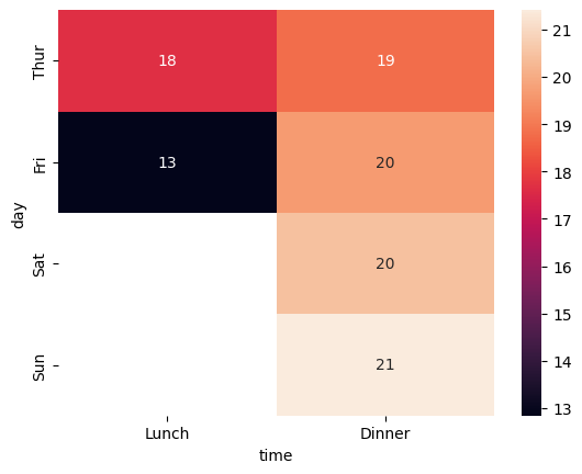
Heatmaps are a way to visualize data in a 2D space. They are often used to show the correlation between variables in a dataset. Its called a heatmap color gradients are used to represent the magnitude of data points
Heatmaps require 3 variables:
x-axis variable, usually categorical
y-axis variable
value variable
In seaborn, you need to filter or pivot your dataframe into a smaller dataframe that contains the x, y, and value variables only.
1# pivot first
2tp = tips.pivot_table(values='total_bill', index="day", columns='time', aggfunc='mean')
3
4# then heatmap
5sns.heatmap(tp, annot=True)
C:\Users\mafud\AppData\Local\Temp\ipykernel_16584\2516421358.py:2: FutureWarning: The default value of observed=False is deprecated and will change to observed=True in a future version of pandas. Specify observed=False to silence this warning and retain the current behavior
  tp = tips.pivot_table(values='total_bill', index="day", columns='time', aggfunc='mean')
<Axes: xlabel='time', ylabel='day'>
Challenge 6-2-3#
Create a streamlit with the fast food dataset.
fast_food_nutrition_cleaned.csv
Let’ input the macro nutrient: protein, fat, carbs, and sugar as a dropdown.
Create a heatmap of the calories vs. the macro nutrient broken down by the type fast food restaurant.
You’ll have to pivot the data to create the heatmap. So use a mean aggregation to create the heatmap… average carbs, etc…
How can you interpret the heatmap you see?